


“The U.S. Small Business Administration helps Americans start, build, and grow businesses. The SBA was created in 1953 as an independent agency of the federal government to aid, counsel, assist and protect the interests of small business concerns, to preserve free competitive enterprise and to maintain and strengthen the overall economy of our nation.”
OBJECTIVE
During this case study we intended on rebuilding the Small Business Association website in order to make it more user-friendly. We ultimately would like to simplify the website in order to become more efficient and effective.

User Persona
When considering a web-redesign we really wanted to focus on the….you guessed it…USER. We did research on what the typical user of the Small Business Association in addition to conducting our own outside research and formulated a User Persona.
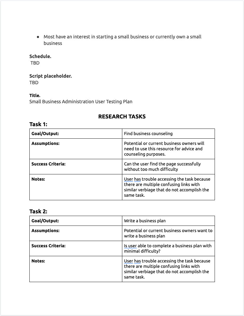
SBA RESEACH PLAN
In order to specify exactly what we wanted to accomplish during the web-redesign we created a research plan in order to stay on track. This process provided us with a guide to always refer back to during the project.

BUT WHY A RE-DESIGN?
While looking through the current website sga.gov it felt very basic and uninviting similar to several other “blocky” websites that have been massed produced. As an entrepreneur I’d want to go to a website in which I felt was welcoming and informational. In addition to that we felt as if there were some organizational/navigational issues that could be resolved. We ended up conducting an UI analysis through several different methods including: card sorting, wireframing, heuristics evaluation, page by page annotations, color accessibility test, sitemap analysis and we even decided to change the logo to fit the new website feel that we wanted to convey.


HOW DID WE SOLVE THIS PROBLEM?

SBA STYLE TILE
We decided to create a style tile to express the essence of the brand in which we were trying to convey. We wanted a more modern, upbeat website. We wanted to go with imagery that displayed the true image of American diversity.
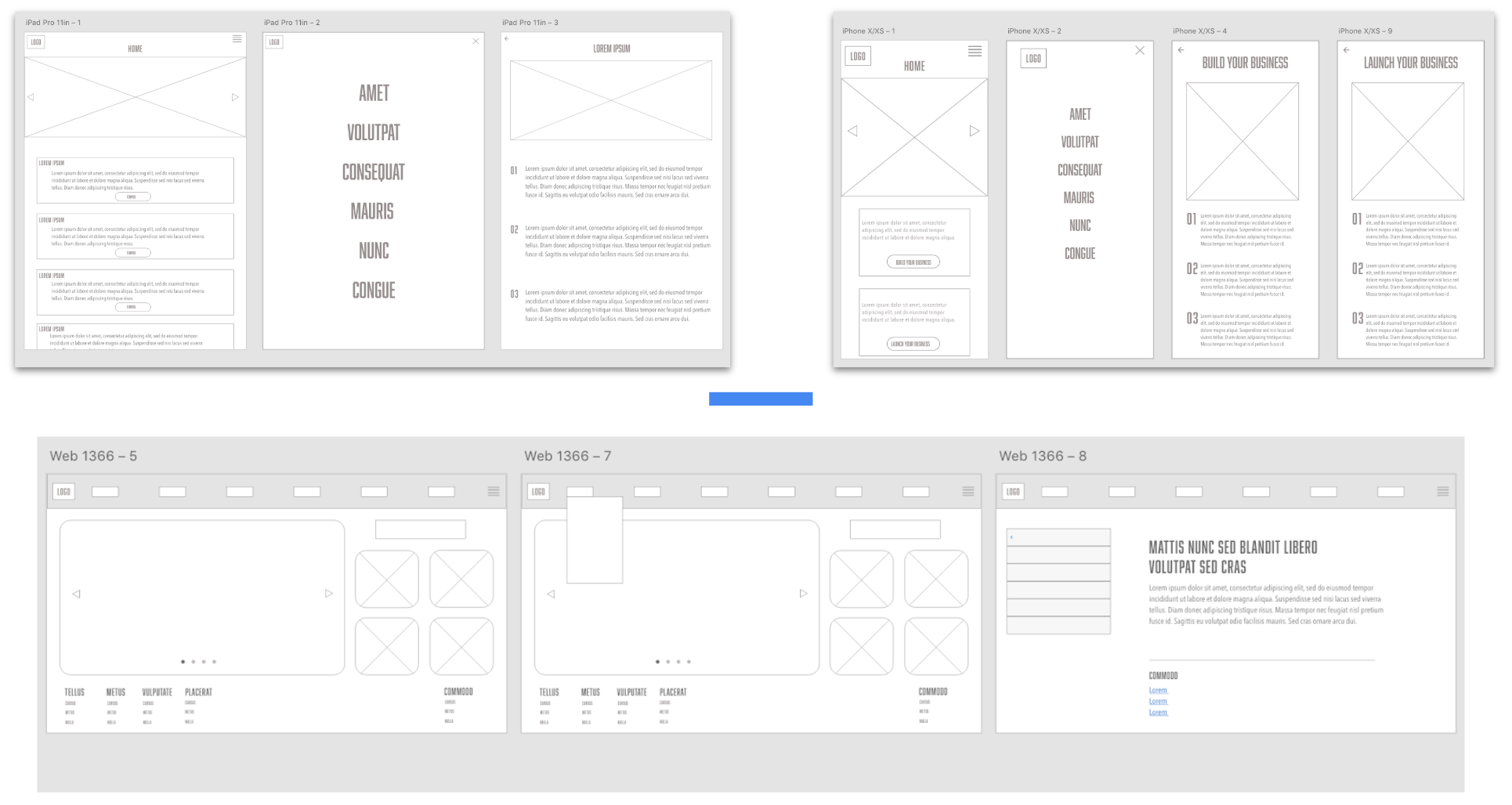
Responsive wireframes (iPhone, iPad, desktop)
We revamped to the current pages in order to make them more user friendly.

Responsive Mobile and desktop homepage mockup
During this step we redesigned every element of the homepage including the navigation bars, footers, logo and additional imagery. Check out our responsive mobile prototype here or/and our responsive desktop prototype.


KEY LEARNINGS AND TAKEAWAYS
In the conclusion of this case study, I have found how effective UI is to the success of a responsive webpage. It’s almost imperative to design your website responsively in order to maximize the success of your organization.